Week 4: Themes and Labels
Prepare a figure for publication and learn about themes and labels in ggplot2.
This is the fourth of a series of posts on how to use ggplot2 to visualise data in R.
We begin by loading the tidyverse package which contains ggplot2 alongside other useful packages. If you haven’t yet, you first need to install the tidyverse package by running install.packages("tidyverse").
library(tidyverse)This week, we take a dataset from an actual study,1 create a figure presenting its main findings, and prepare that figure for publication. This week’s dataset contains 150 observations of four variables.
dl <- read_rds("https://github.com/nilsreimer/data-visualisation-workshop/raw/master/materials/gwtp/dl_wk4.rds")
print(dl, n = 5)
## # A tibble: 150 x 4
## person time condition attitudes
## <int> <ord> <chr> <int>
## 1 1 Before Positive-Negative 38
## 2 1 After Positive-Negative 29
## 3 2 Before Positive-Negative 43
## 4 2 After Positive-Negative 39
## 5 3 Before Positive-Negative 48
## # ... with 145 more rowsThis dataset represents the results from an experiment with three conditions. Participants in the Positive-Positive condition have two positive interactions with an outgroup member, while participants in the Negative-Positive and the Positive-Negative conditions have, respectively, a negative followed by a positive interaction and a positive followed by a negative interaction with an outgroup member.
count(dl, time, condition)## # A tibble: 6 x 3
## time condition n
## <ord> <chr> <int>
## 1 Before Negative-Positive 25
## 2 Before Positive-Negative 25
## 3 Before Positive-Positive 25
## 4 After Negative-Positive 25
## 5 After Positive-Negative 25
## 6 After Positive-Positive 25Once again, this dataset represents within-subjects data in the long format. That is, each person has two observations of the attitudes variable—one before and one after the experimental manipulation.
As last week, we spread the dataset into the wide format wherein each row contains both attitudes values for one person.
dw <- dl %>% spread(time, attitudes)
print(dw, n = 5)
## # A tibble: 75 x 4
## person condition Before After
## <int> <chr> <int> <int>
## 1 1 Positive-Negative 38 29
## 2 2 Positive-Negative 43 39
## 3 3 Positive-Negative 48 52
## 4 4 Positive-Negative 47 55
## 5 5 Positive-Negative 51 49
## # ... with 70 more rowsWe create a within-subjects scatter plot to compare participants’ outgroup attitudes before and after the experimental manipulation.
fig <- ggplot(dw, aes(x = Before, y = After, colour = condition)) +
  geom_abline(intercept = 0, slope = 1, linetype = "dashed") +
  geom_point(aes(shape = condition)) +
  geom_smooth(method = "lm") +
  scale_x_continuous(limits = c(0, 100), minor_breaks = NULL) +
  scale_y_continuous(limits = c(0, 100), minor_breaks = NULL) +
  facet_grid(. ~ condition) +
  coord_fixed(1)
Most of this should be familiar by now. We introduced two things. First, we added the minor_breaks = NULL argument to remove gridlines in between axis values. Second, we used the <- operator to assign the plot we create to a name. We can display the plot by calling its name.
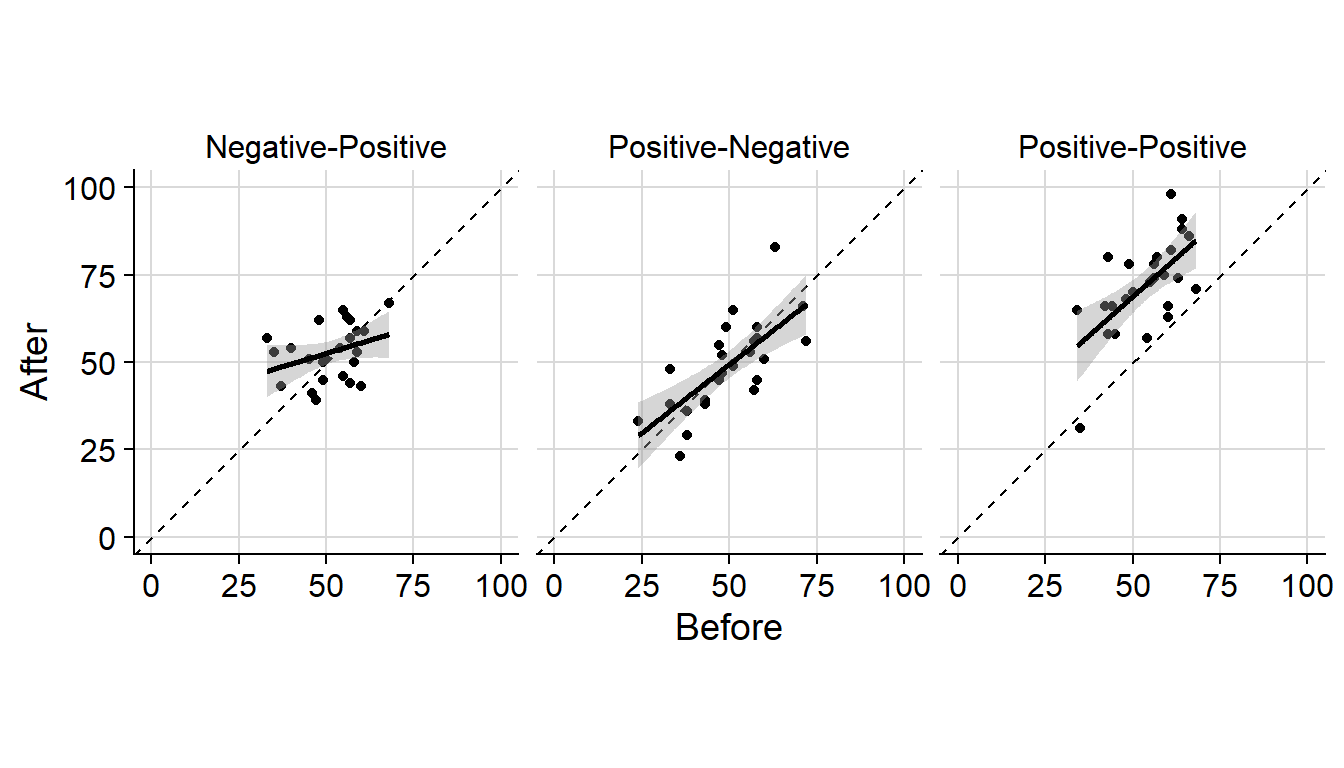
fig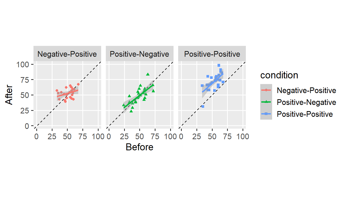
This figure is clear enough—it shows that participants report more favourable attitudes after consecutive positive interactions, but not after mixed experiences.
Still, we might not be satisfied with how the figure looks. For example, we could make more efficient use of the available space by moving the legend. We use the theme() function to move the legend underneath the plot.
fig + theme(legend.position = "bottom")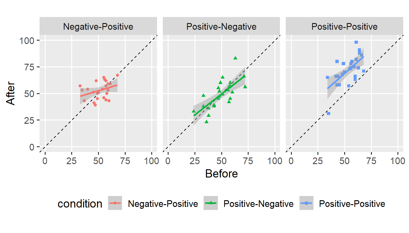
Instead, we might remove the legend as it does not provide any additional information.
fig + theme(legend.position = "none")
legend.position is one of many arguments we can use to change how our plot looks. The theme() function is flexible and allows customising almost all elements that make up a plot. By default, ggplot() applies theme_grey() to create the now-familiar look. We can make this default explicit.
fig +
  theme_grey(base_size = 14, base_line_size = 0.5) +
  theme(legend.position = "none")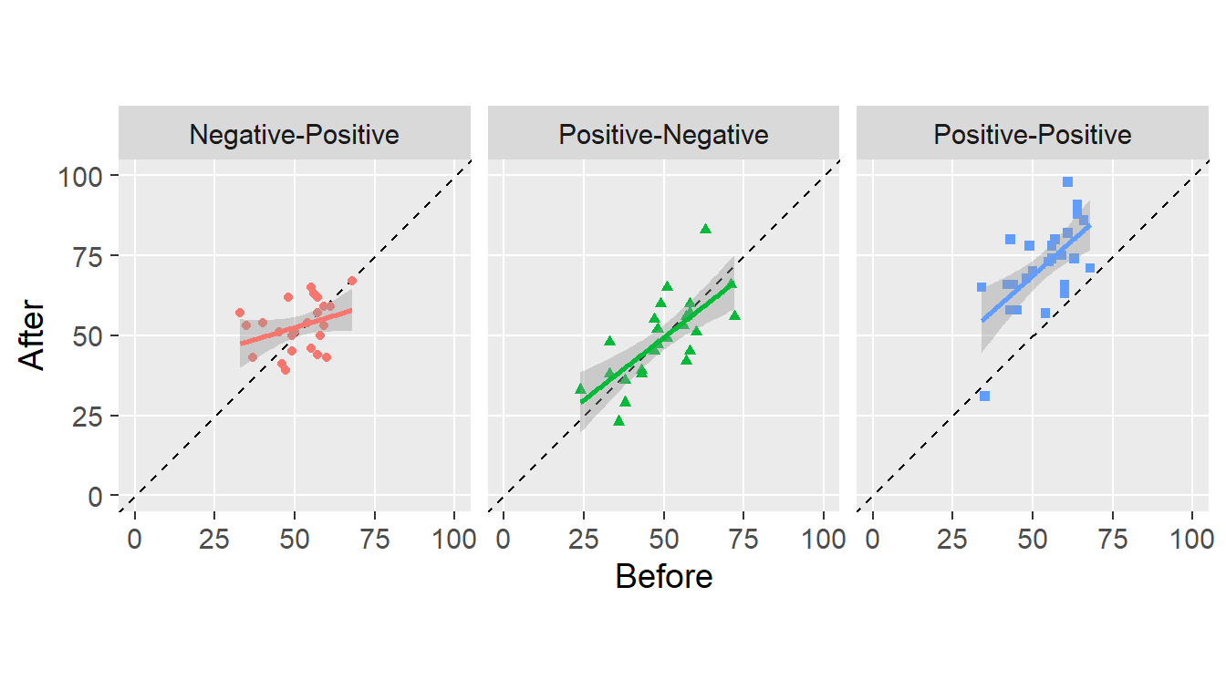
We set the theme to theme_grey() and set the font size to 14 points.2 We can use other themes that come with ggplot2, for example, theme_minimal().
fig +
  theme_minimal(base_size = 14, base_line_size = 0.5) +
  theme(legend.position = "none")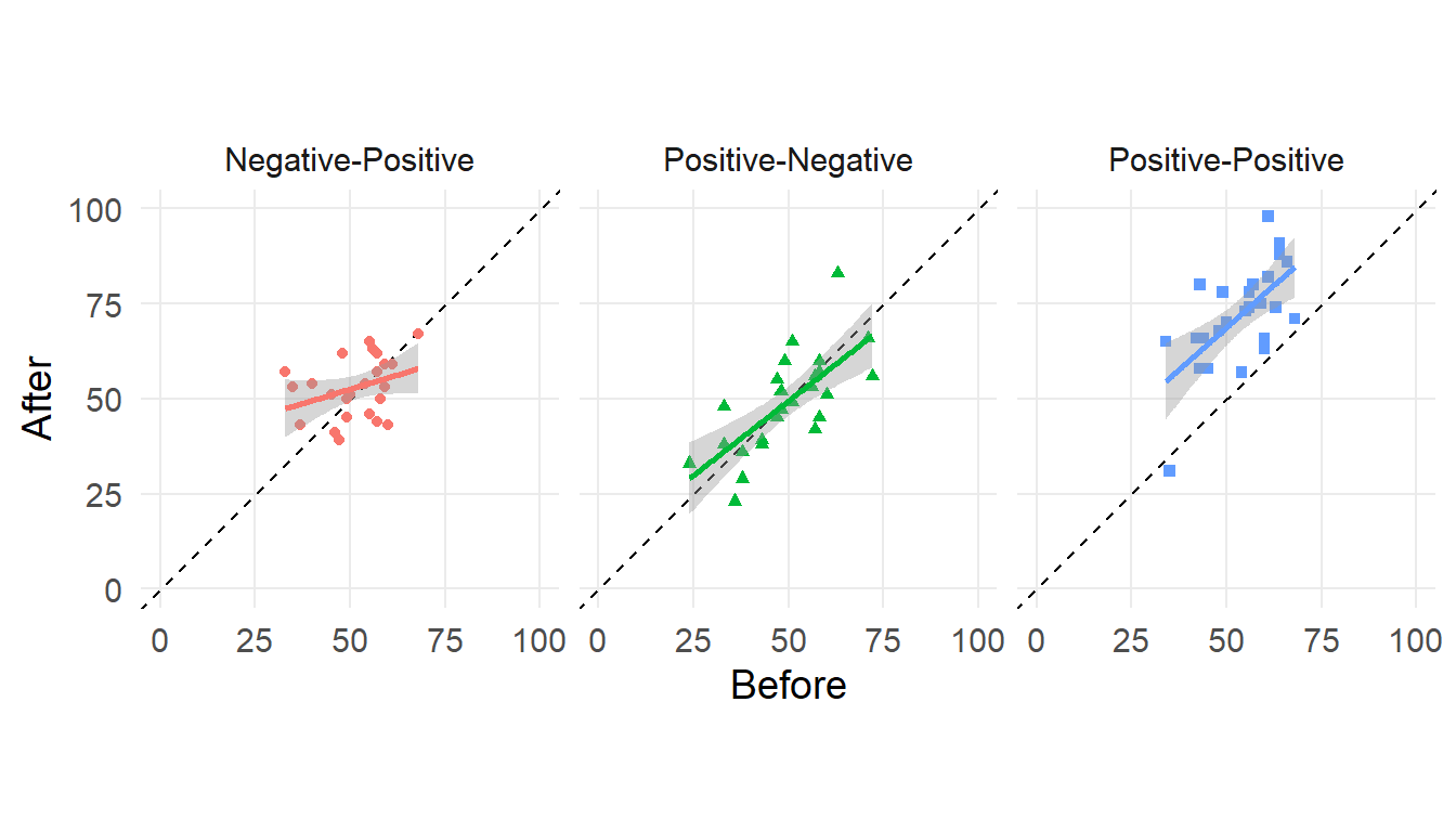
What theme you choose is a matter of taste (and journal policy). I have grown to like the default theme and will use it for the next few examples.
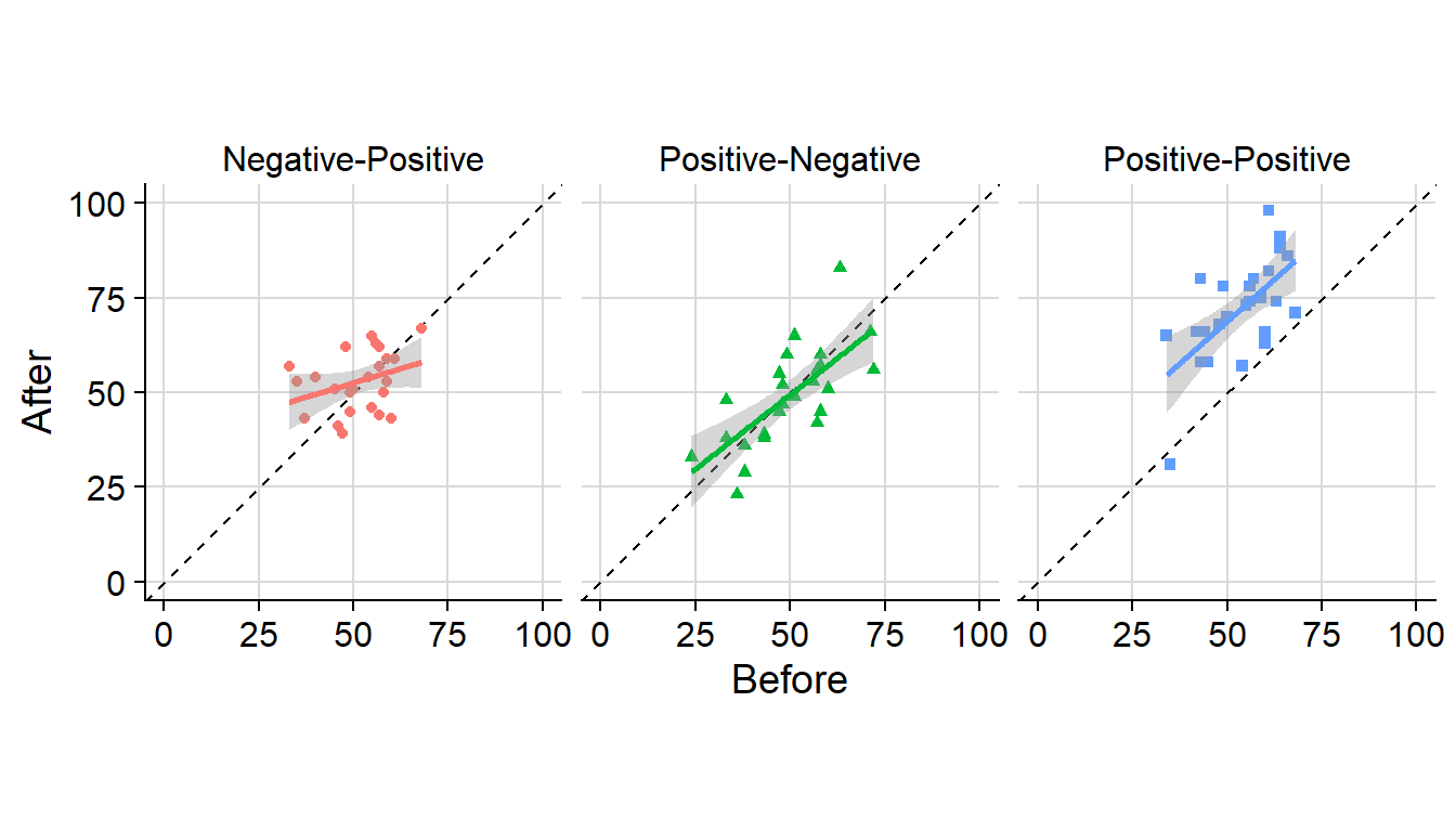
Another thing we might want to change are labels. By default, ggplot() uses variable names to label the corresponding aesthetics. We can change these labels using the labs() function.
fig +
  labs(
    x = "Before",
    y = "After"
  ) +
  theme(legend.position = "none")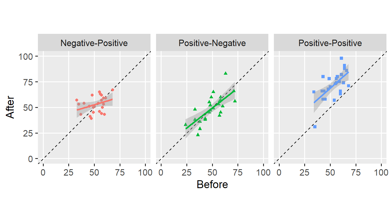
In this case, I left the axis labels as they were. We can also use the labs() function to add a title, subtitle, and caption to the figure.
fig +
  labs(
    title = "Order effects in intergroup contact experiences",
    subtitle = "Consecutive positive contact experiences improved attitudes,\nmixed experiences did not.",
    caption = expression(italic("Reimer et al., 2018"))
  ) +
  theme(legend.position = "none")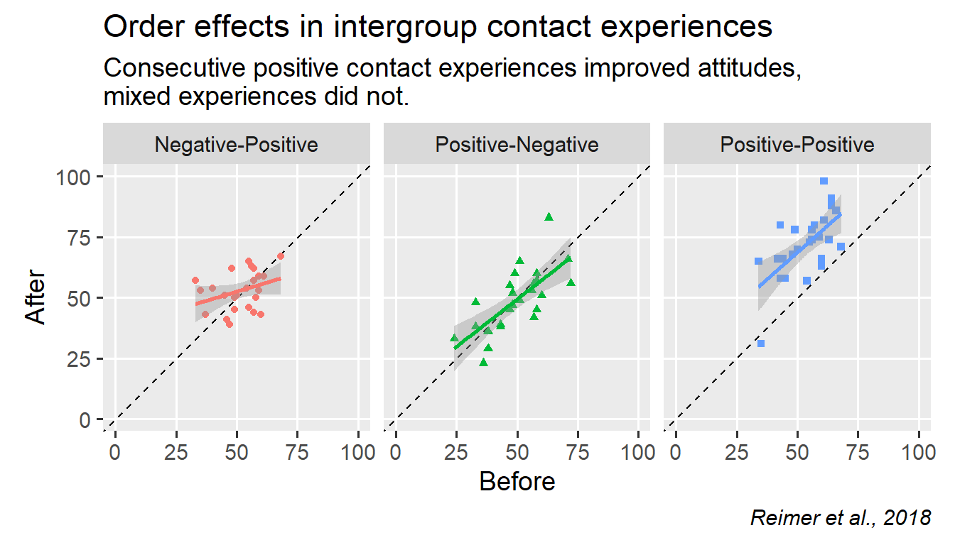
Note that \n forces a line break in any character string (see subtitle). I think this would make a decent figure for publication, though others might prefer a more austere look.
We can install the cowplot package to achieve a more “serious” look.
install.packages("cowplot")We call theme_cowplot() and add it to the plot.
fig +
  cowplot::theme_cowplot(font_size = 14) +
  theme(legend.position = "none")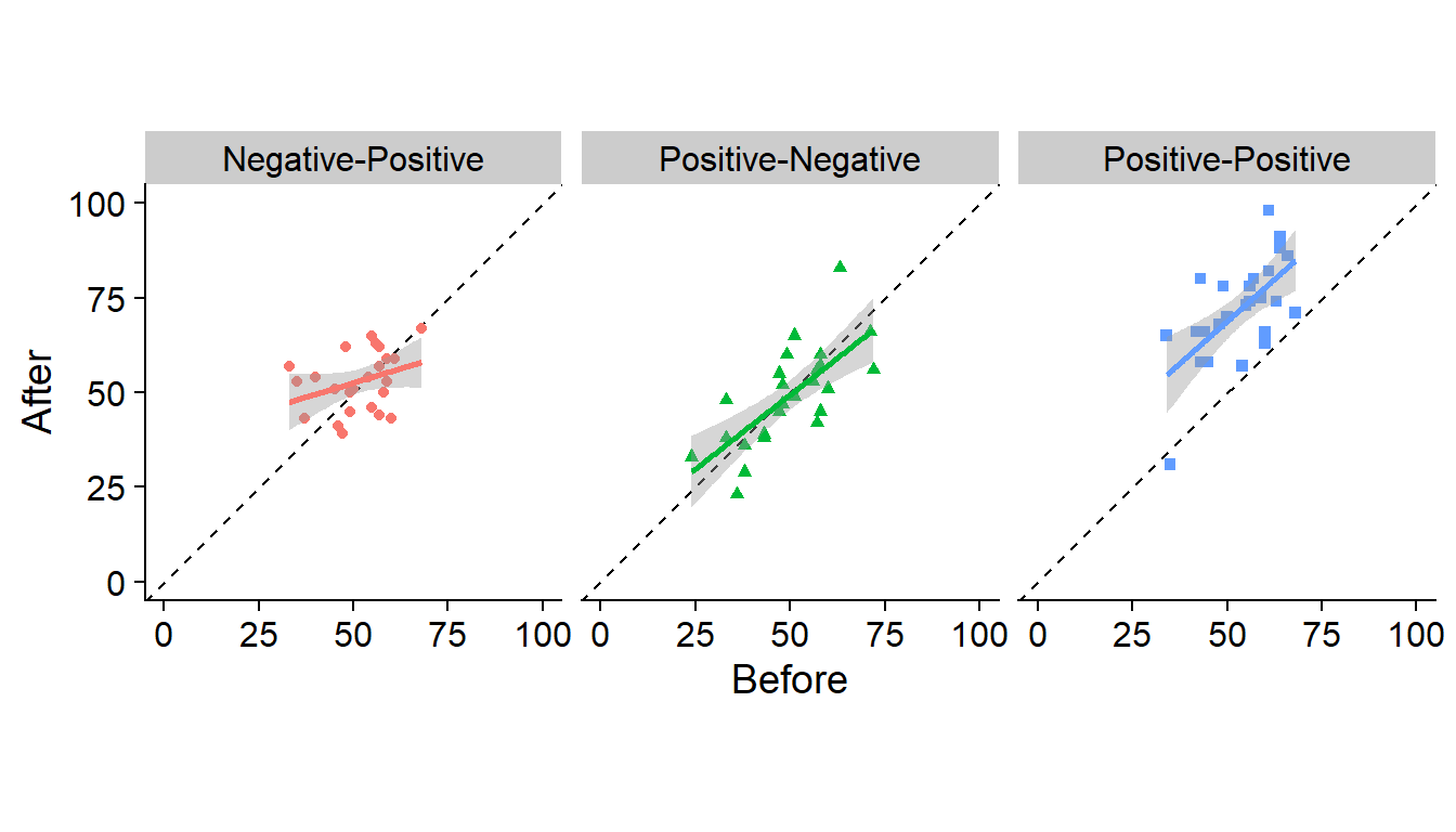
I don’t like the grey background behind the facet titles. We use the theme() function to change this. We also add a background_grid() to the theme.
fig +
  cowplot::theme_cowplot(font_size = 14) +
  cowplot::background_grid(major = "xy", minor = "none") +
  theme(
    legend.position = "none",
    strip.background = element_blank()
  )
Keeping with the austere look, we also remove the colour and shape aesthetics.
ggplot(dw, aes(x = Before, y = After)) +
  geom_abline(intercept = 0, slope = 1, linetype = "dashed") +
  geom_point() +
  geom_smooth(method = "lm", colour = "black") +
  scale_x_continuous(limits = c(0, 100), minor_breaks = NULL) +
  scale_y_continuous(limits = c(0, 100), minor_breaks = NULL) +
  facet_grid(. ~ condition) +
  coord_fixed(1) +
  cowplot::theme_cowplot(font_size = 14) +
  cowplot::background_grid(major = "xy", minor = "none") +
  theme(
    legend.position = "none",
    strip.background = element_blank()
  )
All that’s left is to export the plot. We use the ggsave() function to export the plot.
ggsave("figure.pdf", height = 6, width = 14, units = "cm")
ggsave("figure.png", height = 6, width = 14, units = "cm",
       dpi = 600, type = "cairo-png")
I prefer exporting figures to a vector format (such as .pdf). If you export a figure to a bitmap format (such as .png), you have to specify its resolution (as dots-per-inch). I recommend using type = "cairo-png" for smoother (anti-aliased) lines.
And that’s it for this post. You now understand how to prepare figures for publication. If you have a question or found a mistake, please comment on Twitter or send me an email.
Next week, we’ll take a brief look at annotations and text labels in ggplot2.