Week 3: #BarBarPlots
Learn how (not) to visualise within-subjects data in ggplot2.
This is the third of a series of posts on how to use ggplot2 to visualise data in R. This post introduces some new functions—use the help() if anything is unclear.
We begin by loading the tidyverse package which contains ggplot2 alongside other useful packages. If you haven’t yet, you first need to install the tidyverse package by running install.packages("tidyverse").
library(tidyverse)This week’s dataset contains 160 observations of four variables. Each person has two observations of the outcome variable—one before and one after an unspecified event. This event could be, for example, an experimental manipulation or intervention.
Another variable divides people into two groups—on average, persons in one group score low on the outcome, while persons in the other tend to score high on the outcome. For now, we ignore the group variable.
dl <- read_rds("https://github.com/nilsreimer/data-visualisation-workshop/raw/master/materials/gwtp/dl_wk3.rds")
print(dl, n = 5)
## # A tibble: 160 x 4
## person group time outcome
## <int> <ord> <ord> <int>
## 1 1 low before 41
## 2 1 low after NA
## 3 2 low before 30
## 4 2 low after 20
## 5 3 high before 55
## # ... with 155 more rowsThis dataset represents within-subjects data in the so-called long format. That is, each row represents one of two observations for one of the 80 persons in this dataset. Note that some observations are missing (NA).
The long format is useful for visualising within-subjects data as ggplot2 expects to find one row per data point. We set up our plot using the ggplot() function.
ggplot(dl, aes(x = time, y = outcome)) +
  scale_y_continuous(limits = c(0, 100)) +
  coord_fixed(1/25)
This should all be familiar by now. Note that ggplot() recognises that time is an ordered categorical variable and represents it as such.
We use the stat_summary() function to create a bar plot.
ggplot(dl, aes(x = time, y = outcome)) +
  stat_summary(geom = "bar", fun.y = "mean") +
  scale_y_continuous(limits = c(0, 100)) +
  coord_fixed(1/25)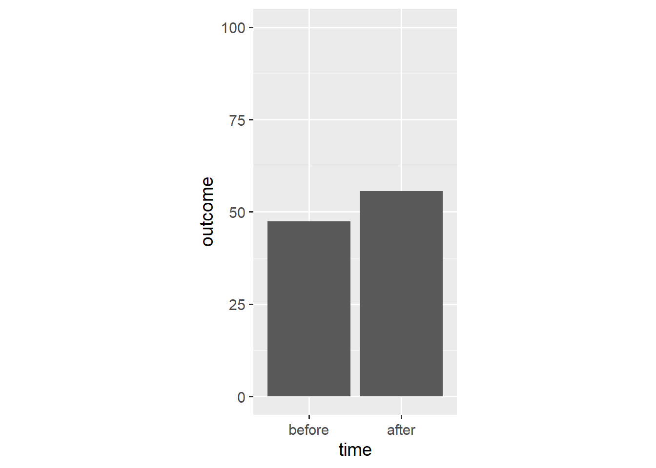
The stat_summary() function aggregates data according to a specified function and represents the resulting aggregate with a specified geom. In this case, stat_summary() applies the mean() function to the outcome data and adds a geom_bar() layer that takes the resulting mean as its y aesthetic.
A bar plot is different from other visualisations we have used thus far. Rather than show each observation, a bar plot summarises all observations. As we will see, this often makes for a misleading visualisation.
For one, bar plots do not communicate the uncertainty around the underlying aggregate. We can remedy this shortcoming by adding error bars to our plot. We again use the stat_summary() function.
ggplot(dl, aes(x = time, y = outcome)) +
  stat_summary(geom = "bar", fun.y = "mean") +
  stat_summary(geom = "errorbar", fun.data = "mean_cl_boot",
               width = 0.1) +
  scale_y_continuous(limits = c(0, 100)) +
  coord_fixed(1/25)
In this case, the mean_cl_boot() function outputs a mean and its bootstrap confidence interval which provides the ymin and ymax aesthetics for a geom_errorbar() layer.
Instead, we can create a geom_pointrange() layer that shows both the point estimate and its confidence interval.
ggplot(dl, aes(x = time, y = outcome)) +
  stat_summary(geom = "bar", fun.y = "mean") +
  stat_summary(geom = "pointrange", fun.data = "mean_cl_boot",
               shape = "diamond filled", fill = "white") +
  scale_y_continuous(limits = c(0, 100)) +
  coord_fixed(1/25)
Now the bars’ only unique function is to point towards y == 0. As such, we can replace them with a simple reference line.
ggplot(dl, aes(x = time, y = outcome)) +
  geom_hline(yintercept = 0, colour = "white", size = 2) +
  stat_summary(geom = "pointrange", fun.data = "mean_cl_boot",
               shape = "diamond filled", fill = "white") +
  scale_y_continuous(limits = c(0, 100)) +
  coord_fixed(1/25)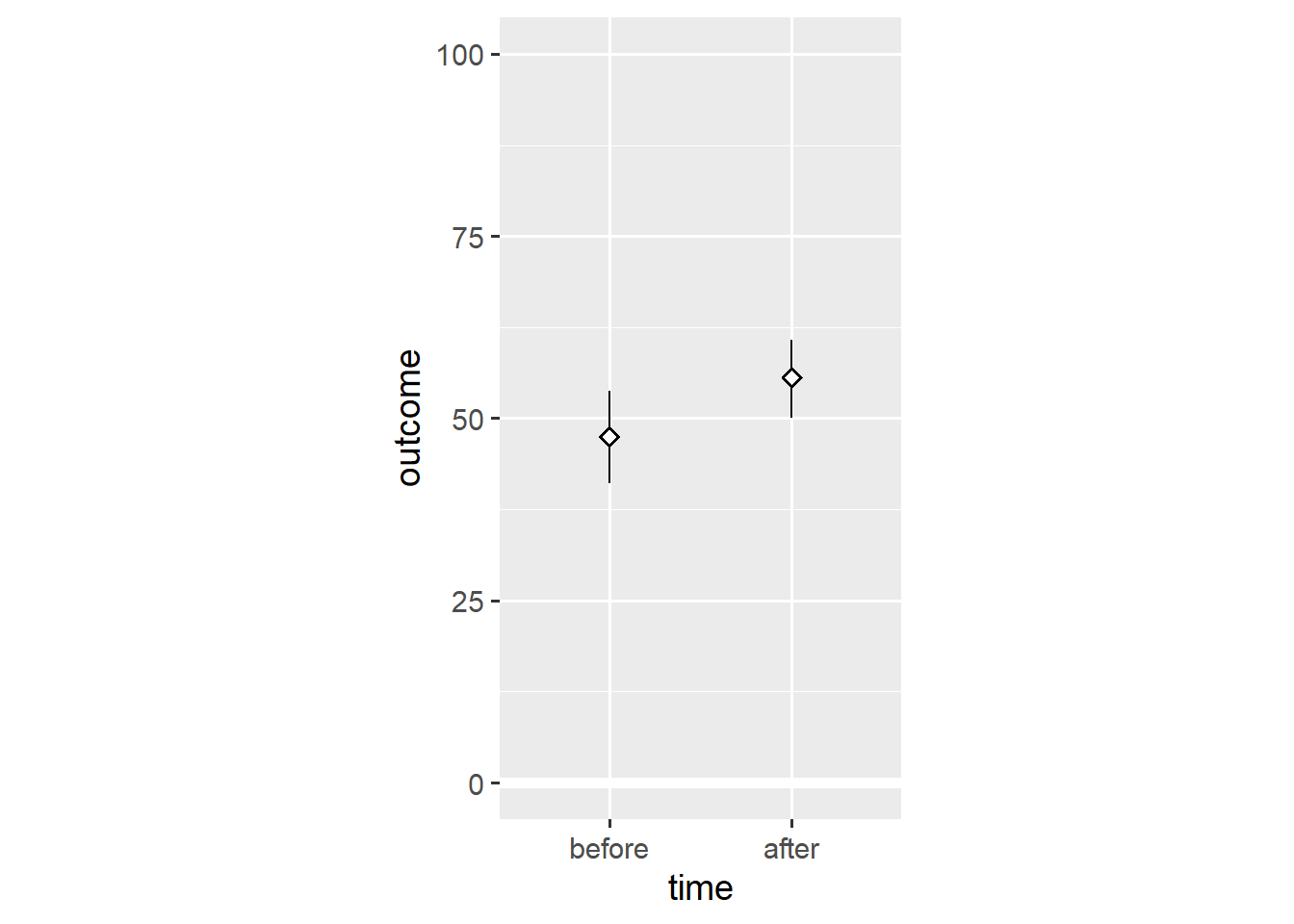
Again, this shows that bar plots are summaries of the underlying data.1 Note that, based on the means, we would conclude that people tend to have higher outcome values after the relevant event.
In the first post, I made the point that ggplot2 doesn’t constrain us to discrete types of plots, but provides a grammar for combining different elements of plots. As such, we can add individual data points to the plot.
ggplot(dl, aes(x = time, y = outcome)) +
  geom_hline(yintercept = 0, colour = "white", size = 2) +
  geom_point(colour = "grey70") +
  stat_summary(geom = "pointrange", fun.data = "mean_cl_boot",
               shape = "diamond filled", fill = "white") +
  scale_y_continuous(limits = c(0, 100)) +
  coord_fixed(1/25)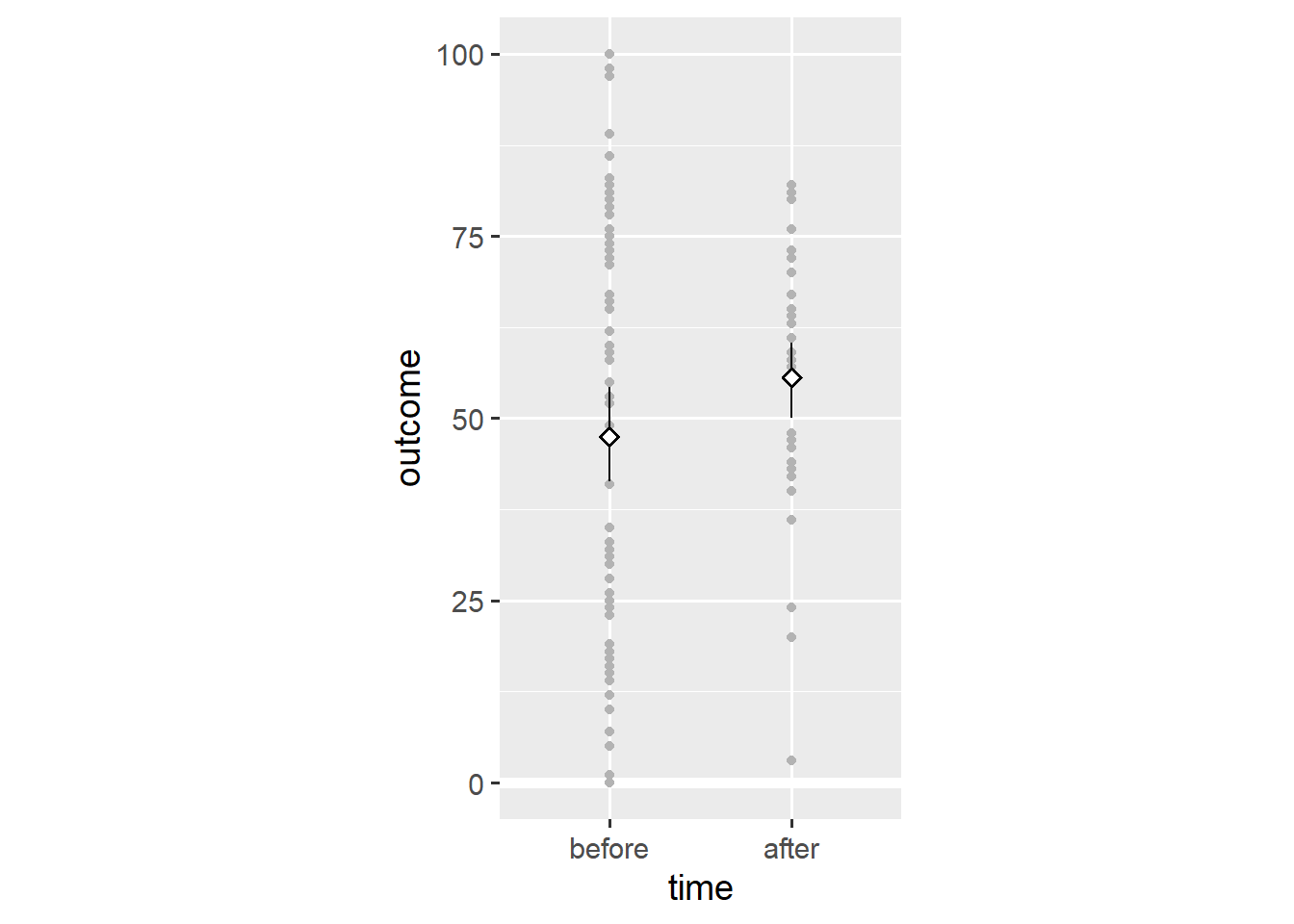
Adding the geom_point() layer reveals the spread of the data. Still, this visualisation doesn’t consider that we’re dealing with within-subjects data—some observations come from the same person. We add lines that connect observations of the same person using the group aesthetic.
ggplot(dl, aes(x = time, y = outcome)) +
  geom_hline(yintercept = 0, colour = "white", size = 2) +
  geom_line(aes(group = person), colour = "grey70") +
  geom_point(colour = "grey70") +
  stat_summary(geom = "pointrange", fun.data = "mean_cl_boot",
               shape = "diamond filled", fill = "white") +
  scale_y_continuous(limits = c(0, 100)) +
  coord_fixed(1/25)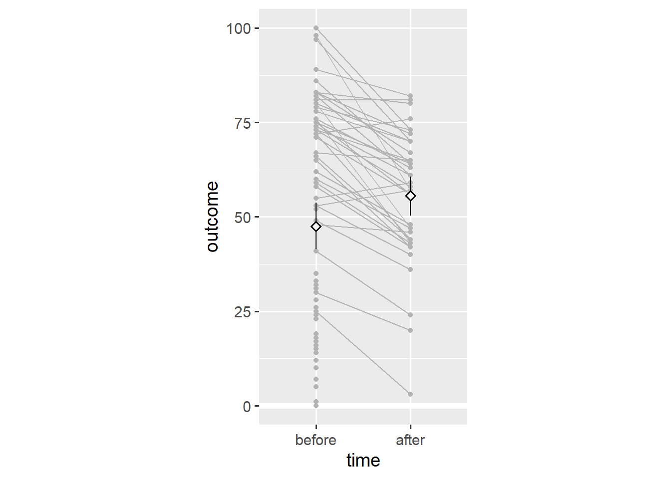
Note that almost every person has a lower outcome value after the relevant event. This is in stark contrast to our earlier conclusion that people tend to have higher outcome values after the relevant event.
To understand what’s going on, we can use the group variable in the dataset (which distinguishes between people low and high on the outcome variable). We create distinct means for each group by using the colour aesthetic.
ggplot(dl, aes(x = time, y = outcome, colour = group)) +
  geom_hline(yintercept = 0, colour = "white", size = 2) +
  stat_summary(geom = "pointrange", fun.data = "mean_cl_boot",
               shape = "diamond filled", fill = "white") +
  scale_y_continuous(limits = c(0, 100)) +
  coord_fixed(1/25)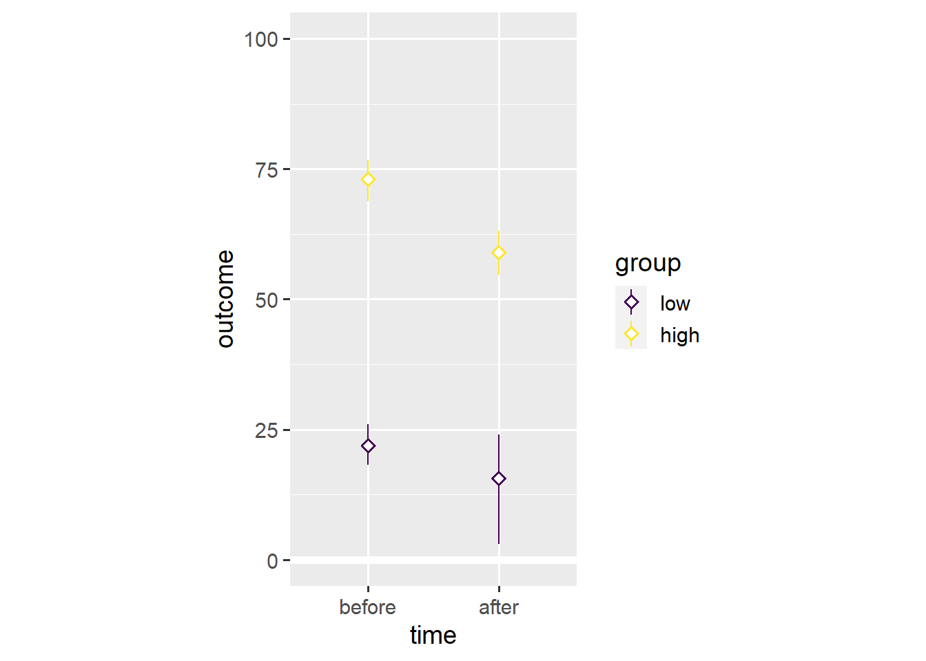
Note that both groups have lower mean values after the event. This is an example of Simpson’s paradox in which a trend in different subgroups of the data disappears or reverses after combining the different subgroups.
We use the colour aesthetic to divide data points into the low and high subgroups.
ggplot(dl, aes(x = time, y = outcome, colour = group)) +
  geom_hline(yintercept = 0, colour = "white", size = 2) +
  geom_line(aes(group = person)) +
  geom_point() +
  scale_y_continuous(limits = c(0, 100)) +
  coord_fixed(1/25)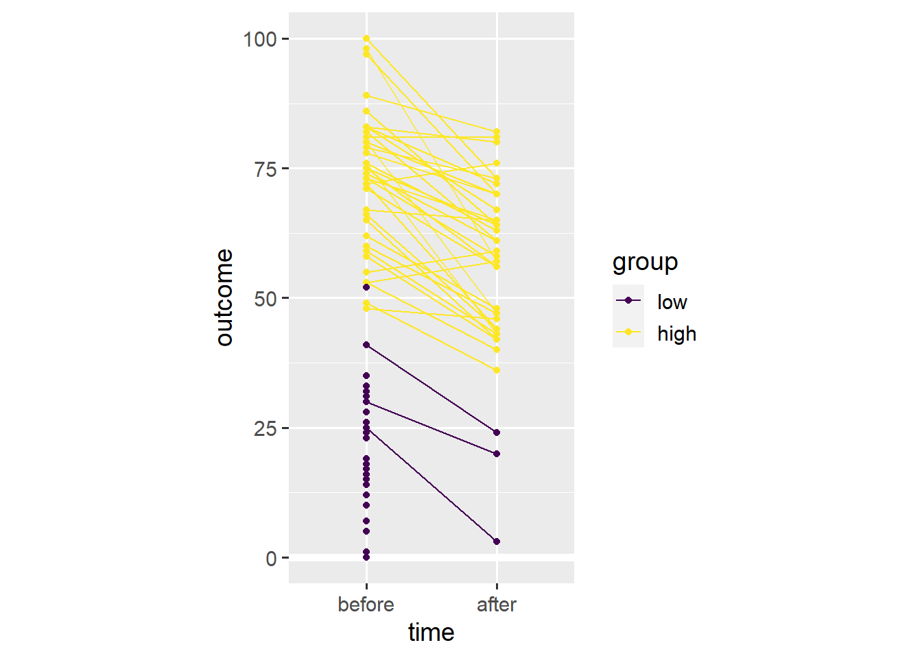
In this case, Simpson’s paradox resulted from differential dropout. Far more people with low initial values on the outcome variable seem to have dropped out before the second time point. As such, the average across the remaining people is higher after the relevant event, even though almost everyone’s outcome value has gone down.
Had we stuck with a bar plot, we wouldn’t have noticed. Presenting continuous data as a bar plot is misleading because it hides the distribution of the underlying data. Presenting within-subjects data as a bar plot is misleading because doing so hides individual trajectories in the underlying data.2
Above, we have already used one alternative to the bar plot. We introduce the within-subjects scatter plot as another alternative.3 First, we need to spread the dataset into the wide format wherein each row contains both outcome values for one person.
dw <- dl %>% spread(time, outcome)
print(dw, n = 5)
## # A tibble: 80 x 4
## person group before after
## <int> <ord> <int> <int>
## 1 1 low 41 NA
## 2 2 low 30 20
## 3 3 high 55 59
## 4 4 low 23 NA
## 5 5 high 53 40
## # ... with 75 more rowsSecond, we create a scatter plot akin to the ones we’ve created in the first two posts.
ggplot(dw, aes(x = before, y = after)) +
  geom_point() +
  scale_x_continuous(limits = c(0, 100)) +
  scale_y_continuous(limits = c(0, 100)) +
  coord_fixed(1)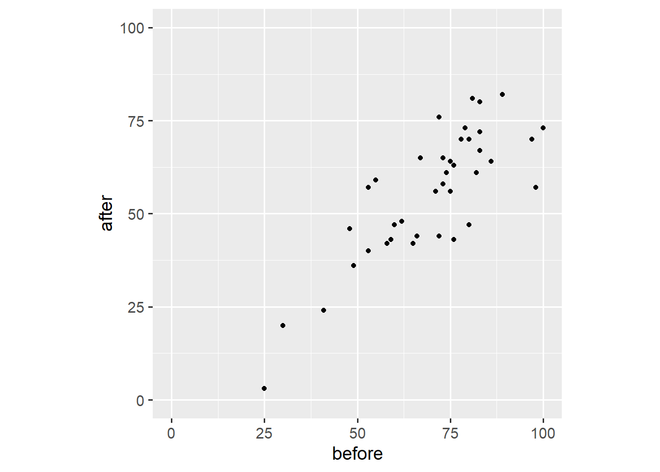
Third, we add a reference line that marks all points for which before == after.
ggplot(dw, aes(x = before, y = after)) +
  geom_abline(intercept = 0, slope = 1, linetype = "dashed") +
  geom_point() +
  scale_x_continuous(limits = c(0, 100)) +
  scale_y_continuous(limits = c(0, 100)) +
  coord_fixed(1)
Note that we fixed the axis ratio to 1. This plot shows that three people have higher outcome values after the event, that one person has the same outcome value after the event, and that most people have lower outcome values after the event. This plot is useful because it shows both the overall trend and individual variation. Other than our earlier plot, this plot doesn’t show dropout.
And that’s it for this post. You now understand why you shouldn’t use bar plots to visualise within-subjects data—and what to use instead. If you have a question or found a mistake, please comment on Twitter or send me an email.
Next week, we’ll work with themes to prepare figures for publication.
Count data are a special case where all we have is a summary. In this case, a bar plot might make sense.↩︎
Weissgerber et al. (2015) and Rousselet et al. (2017) present further arguments and examples, and highlight alternatives to the bar plot.↩︎
I thank Matti Vuorre for the inspiration.↩︎