Week 1: A First Plot
Create your first plot and learn about the elements that make up ggplot2.
This is the first of a series of posts on how to use ggplot2 to visualise data in R.
We begin by loading the tidyverse package which contains ggplot2 as well as a host of other useful packages. If you haven’t yet, you first need to install the tidyverse package by running install.packages("tidyverse").
library(tidyverse)Next, we need some data. For this post, we download a dataset from my data visualisation lecture.1
d1 <- read_rds("https://github.com/nilsreimer/data-visualisation-workshop/raw/master/materials/d1.rds")Before plotting anything, we should get to know the data. We look at the first five rows of the dataset.
print(d1, n = 5)## # A tibble: 161 x 4
## V1 V2 V3 V4
## <dbl> <int> <chr> <chr>
## 1 3.7 59 Experimental Group 1
## 2 3.4 45 Control Group 2
## 3 3.5 49 Control Group 1
## 4 2.8 48 Experimental Group 2
## 5 4.2 90 Experimental Group 2
## # ... with 156 more rowsFrom this, we learn that the dataset contains 161 observations of 4 variables—two numeric variables and two character variables. V1 and V2 could be, for example, responses to survey items, while V3 and V4 seem like grouping variables. We start by plotting the two numeric variables (V1, V2) against each other. We might do this if we were interested in the relationship between the two variables.
In Excel or SPSS, we would do this by selecting the scatterplot from a list of various visualisations. Point-and-click programs tend to rely on a typology of visualisations, limiting you to one kind of visualisation per plot. ggplot2 is different in that it uses a grammar of graphics, allowing you to build your plot from various elements described by its grammar.
We begin by setting up our plot using the ggplot() function.
ggplot(data = d1, mapping = aes(x = V1, y = V2))The ggplot() function has two arguments. data defines which dataset to use for the plot; this allows us to refer to V1 and V2 without repeating from which dataset they come. mapping defines which variables are mapped onto which aesthetics. Aesthetics are the visual properties of the elements that make up the plot. For example, aes(x = V1, y = V2) means that the x and y aesthetics of all elements will be mapped onto the variables V1 and V2, respectively. I promise this will all make sense once we get to some concrete examples.
We don’t usually have to spell out data and mapping.
ggplot(d1, aes(x = V1, y = V2))
Running this function creates an empty grid with the two axes we have mapped onto the V1 and V2 variables. ggplot2 implements a layered grammar of graphics. The ggplot() function creates a base layer with some useful defaults—for example, that the x- and y-axis roughly correspond to the range of the data. We can add other elements on top of that layer using the + operator.
ggplot(d1, aes(x = V1, y = V2)) +
  geom_point()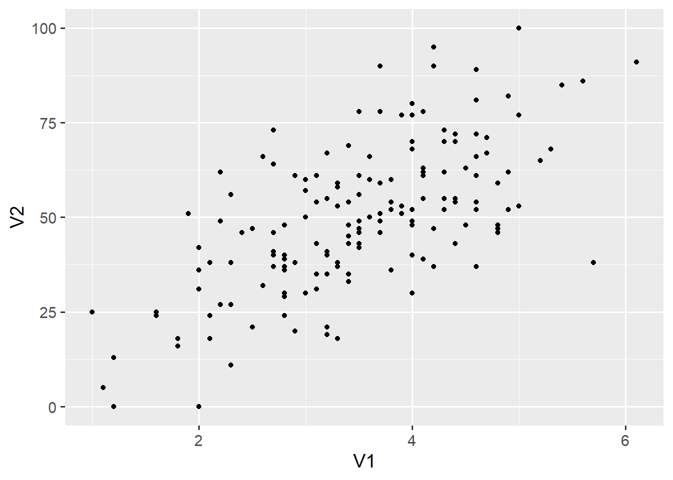
geom_point() adds a layer of points on top of the base layer. Geoms are the geometric shapes that make up ggplot2 visualisations. Each is called with a function that begins with geom_* and ends with the name of the geom (e.g., point or line). Each geom has a number of aesthetics that define its visual properties. In this case, geom_point() inherits the x and y aesthetics from the ggplot() function. We can add other aesthetics.
ggplot(d1, aes(x = V1, y = V2)) +
  geom_point(size = 2)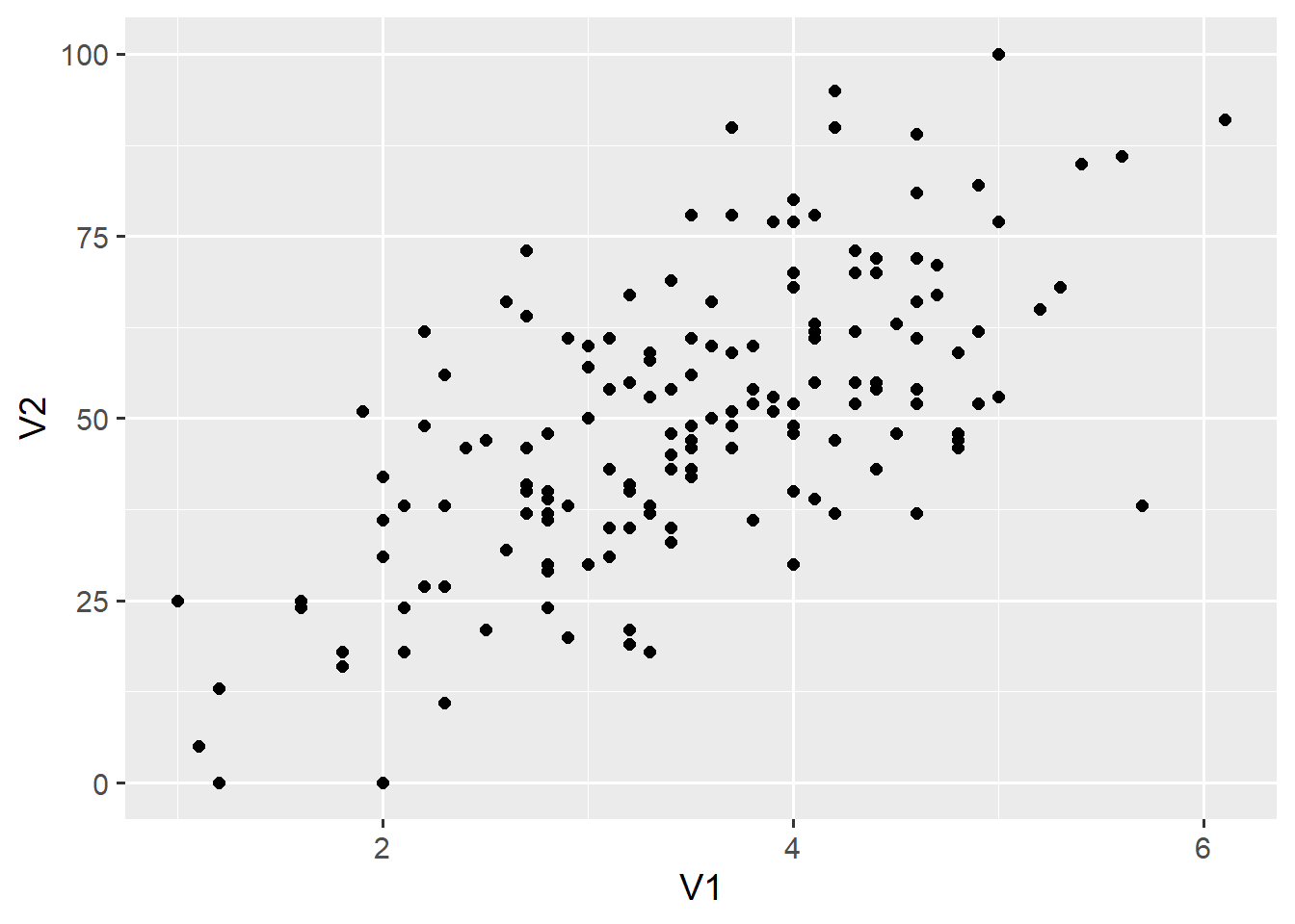
Unsurprisingly, the size aesthetic influences the size of the points in this layer. Note that we have specified the size argument outside the aes() function. Let’s add another aesthetic inside the aes() function to illustrate the difference.
ggplot(d1, aes(x = V1, y = V2)) +
  geom_point(aes(shape = V3), size = 2)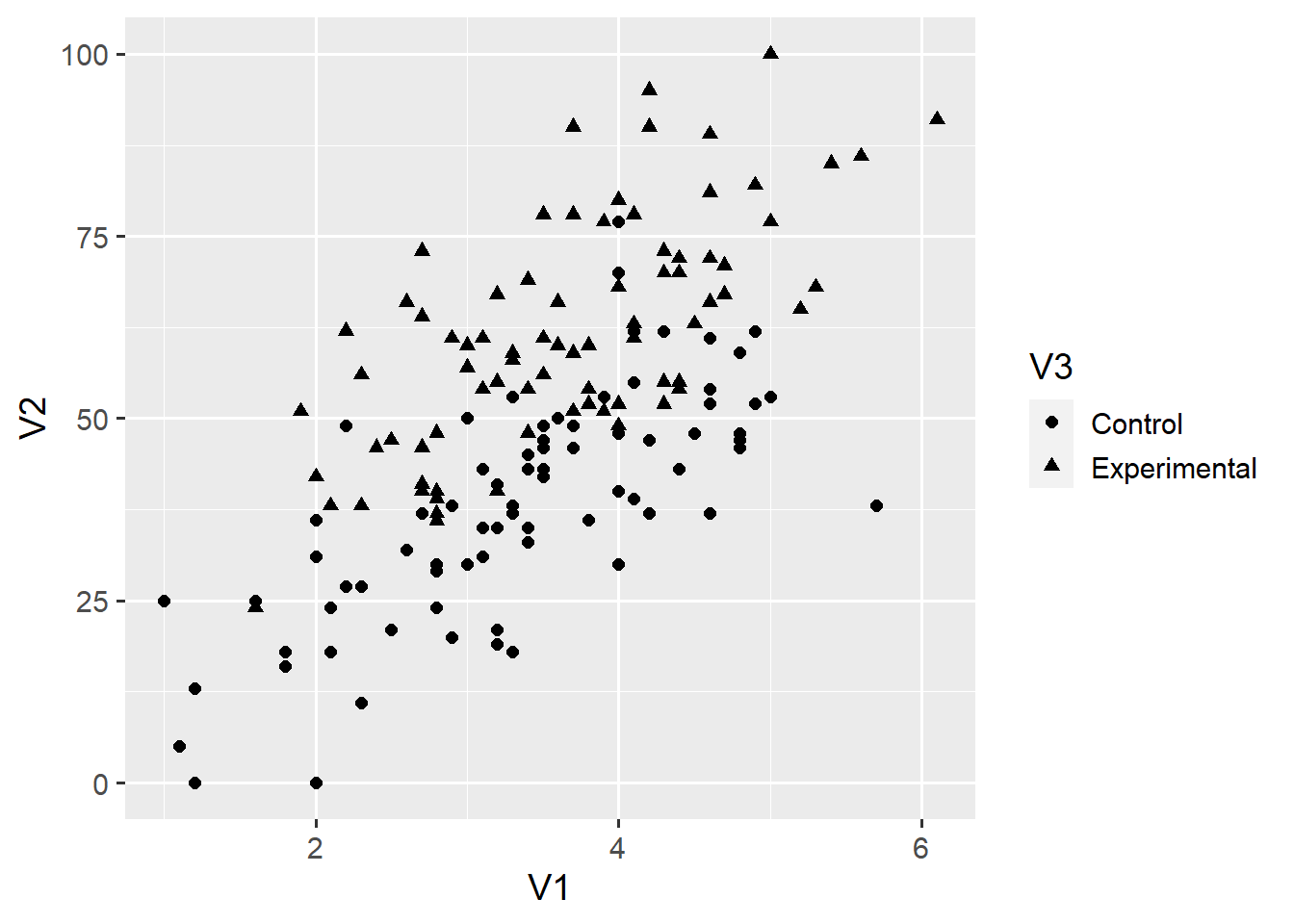
aes(shape = V3) maps the shape aesthetic onto the categorical V3 variable, and adds the corresponding legend to the plot. Had we instead included shape = "triangle" outside the aes() function, all points would become triangles. To find all aesthetics that apply to the geom_point() function, call the help() function by running ?geom_point. You can find a useful list of all aesthetic specifications here.
At this point, we could add other geom_* layers by using the + operator—but we’ll leave this for future posts. Instead, we add another kind of element to the plot.
ggplot(d1, aes(x = V1, y = V2)) +
  geom_point(aes(shape = V3), size = 2) +
  scale_x_continuous(limits = c(1, 7), breaks = 1:7) +
  scale_y_continuous(limits = c(0, 100))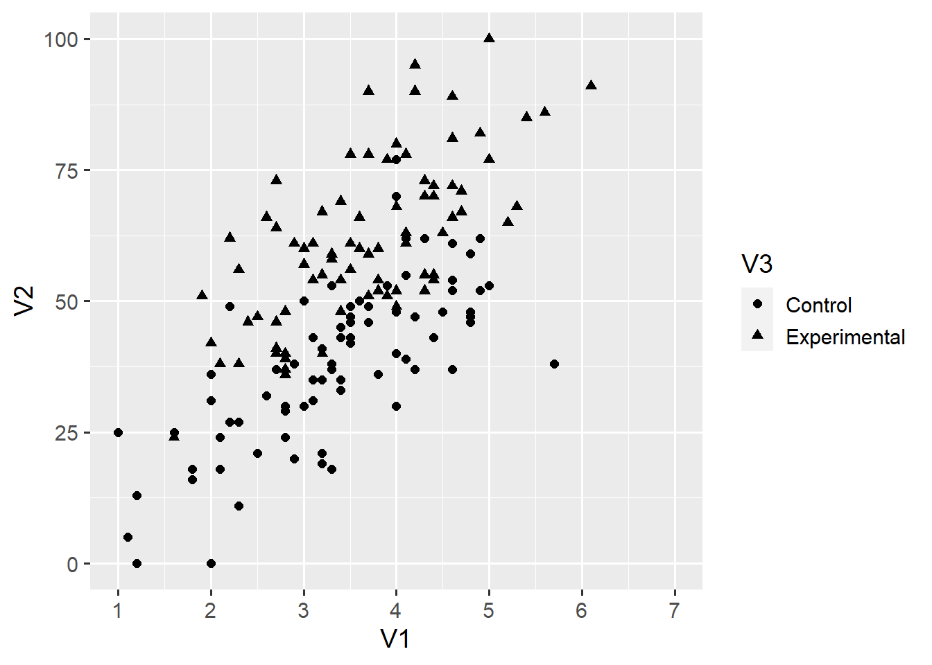
Each aesthetic has a corresponding scale that takes the form scale_*. We don’t have to spell out each scale as long as we are happy with the default. Above, we have called the scale_x_continuous() function to change the scale for the x-axis. The limits = c(1, 7) argument forces ggplot2 to have an x-axis ranging from 1 to 7. The breaks = 1:7 argument labels all integers from 1 to 7 on the x-axis. We can add another scale for the shape aesthetic.
ggplot(d1, aes(x = V1, y = V2)) +
  geom_point(aes(shape = V3), size = 2) +
  scale_x_continuous(limits = c(1, 7), breaks = 1:7) +
  scale_y_continuous(limits = c(0, 100)) +
  scale_shape_discrete(solid = FALSE)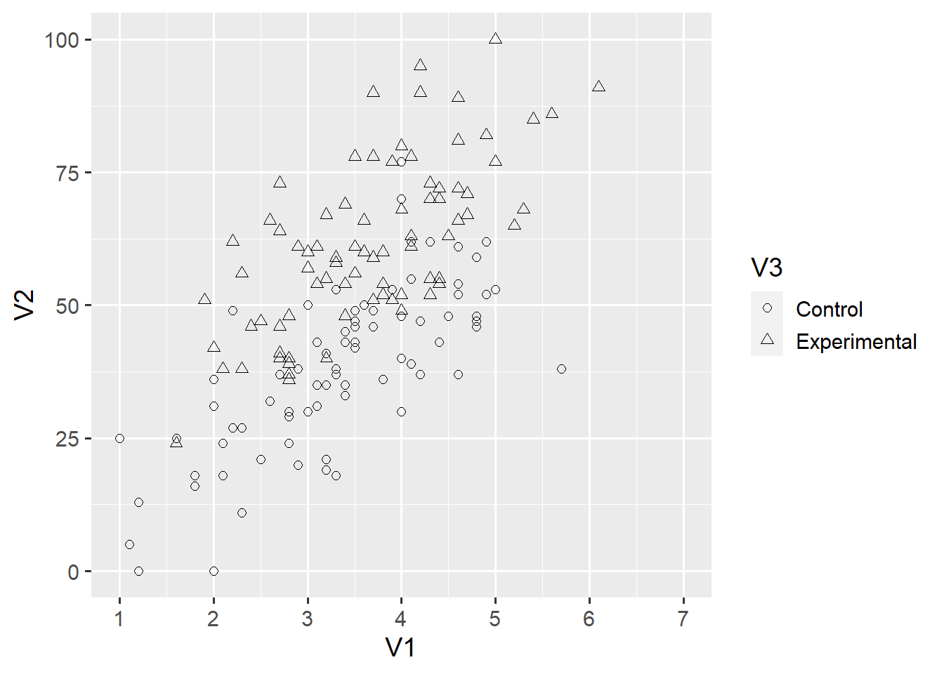
Again, you can use the help() function to find out what you can change about each scale. Another element of the ggplot2 grammar are coordinate systems. By default, ggplot() assumes a Cartesian coordinate system (coord_cartesian). Here, we use coord_fixed() to define a Cartesian coordinate system with a fixed axis ratio.
ggplot(d1, aes(x = V1, y = V2)) +
  geom_point(aes(shape = V3), size = 2) +
  scale_x_continuous(limits = c(1, 7), breaks = 1:7) +
  scale_y_continuous(limits = c(0, 100)) +
  coord_fixed(ratio = 6/100)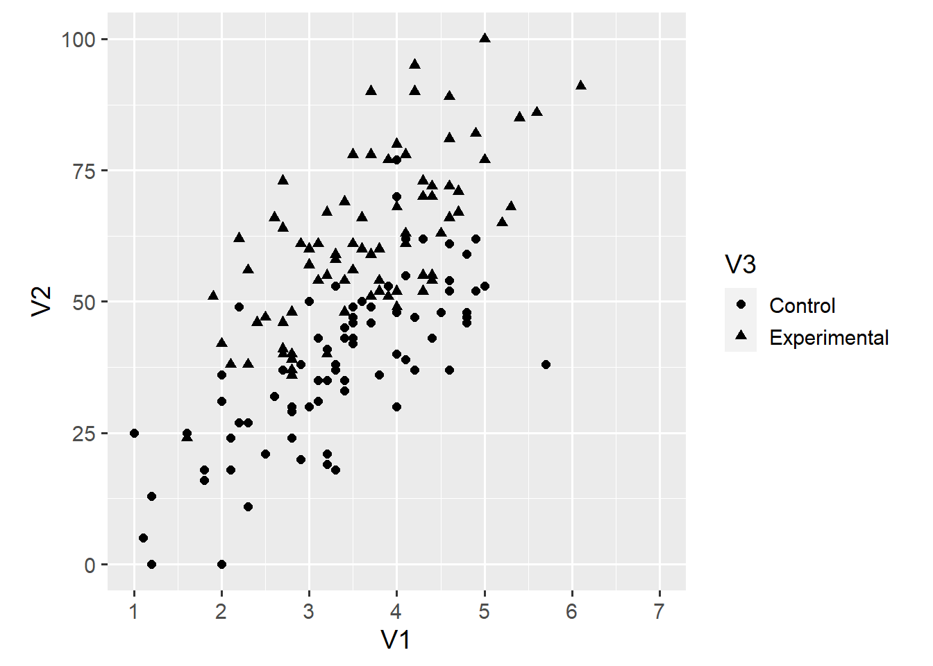
In this case, the ratio = 6/100 argument creates a square plot. Coordinate systems can be very useful as we’ll discuss in a future post. Thus far, we have used variables V1, V2 and V3 in our visualisation. ggplot2 is flexible enough to also include the remaining variable. For example, we can use the colour aesthetic to map each point’s colour onto the V4 variable.
ggplot(d1, aes(x = V1, y = V2)) +
  geom_point(aes(shape = V3, colour = V4), size = 2) +
  scale_x_continuous(limits = c(1, 7), breaks = 1:7) +
  scale_y_continuous(limits = c(0, 100)) +
  coord_fixed(ratio = 6/100)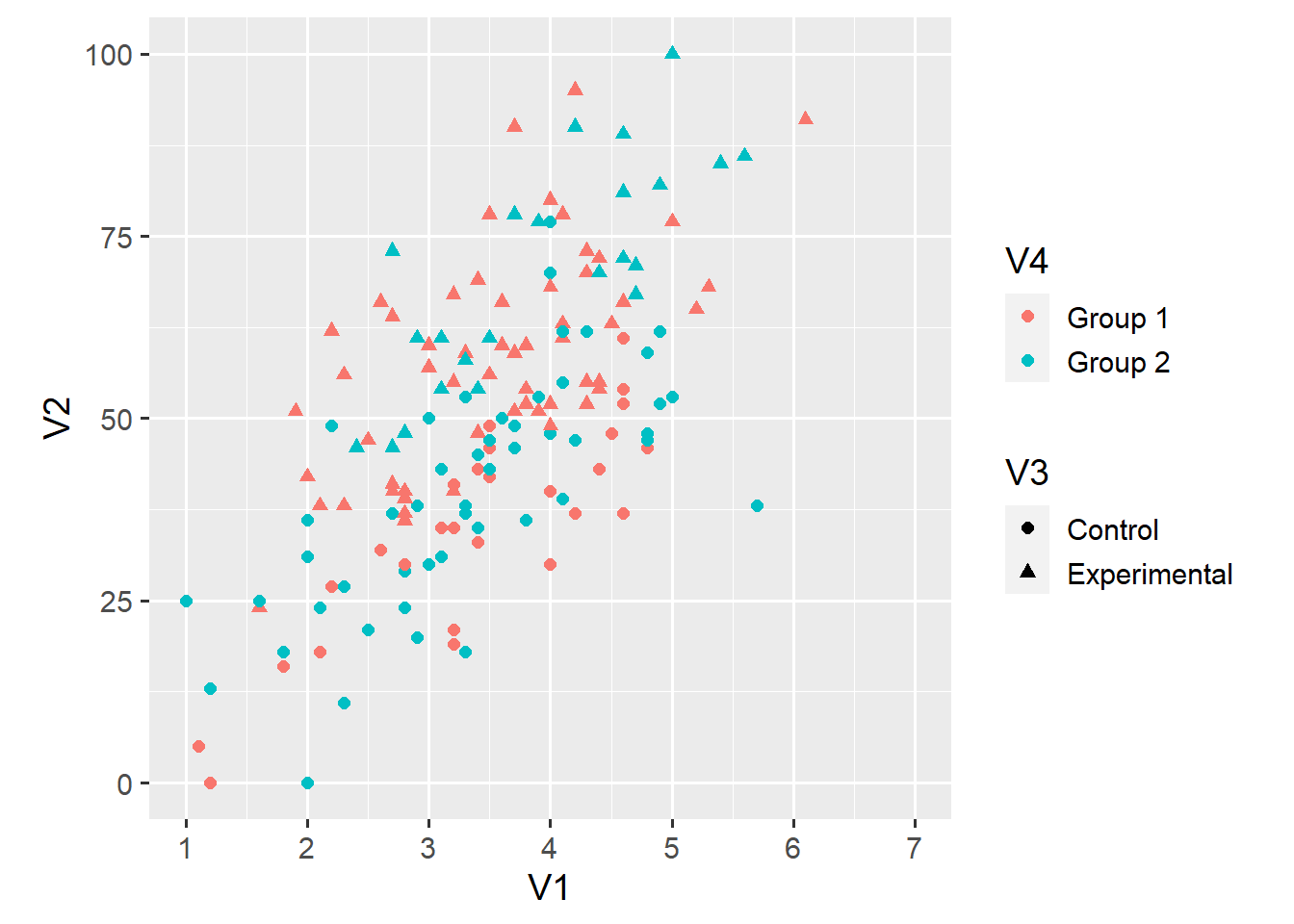
This argument also adds a second legend to the plot. This change shows two things—first, that you can do a lot with ggplot2 and, second, that you probably shouldn’t. Looking at this plot, I find it hard to say whether the relationship between V1 and V2 depends either on the condition (V3) or the group (V3) of an observation.
This brings us to the last element I want to introduce. ggplot2 makes it very easy to create small multiples of a plot. Here, we use the facet_grid() function to create separate plots for each value of V4.
ggplot(d1, aes(x = V1, y = V2)) +
  geom_point(aes(shape = V3, colour = V4), size = 2) +
  scale_x_continuous(limits = c(1, 7), breaks = 1:7) +
  scale_y_continuous(limits = c(0, 100)) +
  coord_fixed(ratio = 6/100) +
  facet_grid(. ~ V4)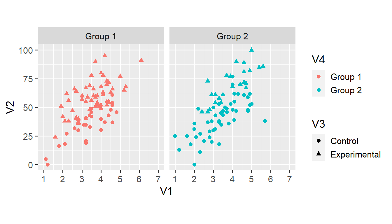
We’ll cover faceting in more detail later in this series. For now, note that faceting makes it much easier to examine the relationship between V1 and V2 across the two categorical variables. However, the colour doesn’t seem particularly useful in the new plot. Instead, we can map both shape and colour onto variable V3.
ggplot(d1, aes(x = V1, y = V2)) +
  geom_point(aes(shape = V3, colour = V3), size = 2) +
  scale_x_continuous(limits = c(1, 7), breaks = 1:7) +
  scale_y_continuous(limits = c(0, 100)) +
  coord_fixed(ratio = 6/100) +
  facet_grid(. ~ V4)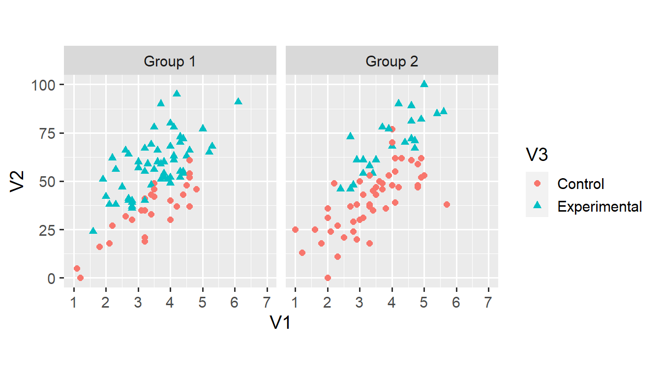
Note that the legend now reflects both aesthetics. Mapping two aesthetics onto the same variable sometimes makes for a better plot. In this case, the shape aesthetic makes the plot more accessible for people with colour vision deficiencies.
And that’s it for this post. You now understand the basic elements of ggplot2 and are well on your way towards building more complex data visualisations. If you have a question—or found a mistake—please comment on Twitter or send me an email.
There are other elements that we’ll cover in future posts—for example, stat_* layers or the theme() function. Next week, we’ll continue working with this dataset. I’ll write some more about faceting, and introduce some new geoms and aesthetics.