Week 2: Facets and Curves
Create small multiples and learn about facets and curves in ggplot2.
This is the second of a series of posts on how to use ggplot2 to visualise data in R. If you haven’t, take a look at the first post before reading on.
We begin by loading the tidyverse package which contains ggplot2 alongside other useful packages. If you haven’t yet, you first need to install the tidyverse package by running install.packages("tidyverse").
library(tidyverse)We continue working with last week’s dataset. This dataset contains 161 observations of two numeric variables (V1, V2) and two categorical variables (V3, V4).
d1 <- read_rds("https://github.com/nilsreimer/data-visualisation-workshop/raw/master/materials/d1.rds")
print(d1, n = 5)
## # A tibble: 161 x 4
## V1 V2 V3 V4
## <dbl> <int> <chr> <chr>
## 1 3.7 59 Experimental Group 1
## 2 3.4 45 Control Group 2
## 3 3.5 49 Control Group 1
## 4 2.8 48 Experimental Group 2
## 5 4.2 90 Experimental Group 2
## # ... with 156 more rowsLast week, we set out to explore whether the relationship between V1 and V2 depends either on the condition (V3) or the group (V3) of an observation. We ended up with this less-than-ideal plot in which each point’s shape maps onto V3 and each point’s colour maps onto V4.
ggplot(d1, aes(x = V1, y = V2)) +
  geom_point(aes(shape = V3, colour = V4), size = 2) +
  scale_x_continuous(limits = c(1, 7), breaks = 1:7) +
  scale_y_continuous(limits = c(0, 100)) +
  coord_fixed(ratio = 6/100)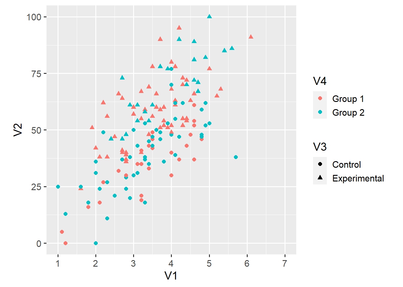
In theory, this plot gives us all the information we need to answer our question. In practice, this plot makes it hard to tell whether the relationship between V1 and V2 differs across either V3 or V4 or both.
A small multiple is a series of plots that show the same geoms, aesthetics, scales, and axes—but for different subsets of the data. In ggplot2, we can easily create small multiples using so-called facets. For example, we can create distinct plots for observations in Group 1 and Group 2.
ggplot(d1, aes(x = V1, y = V2)) +
  geom_point(aes(shape = V3, colour = V4), size = 2) +
  scale_x_continuous(limits = c(1, 7), breaks = 1:7) +
  scale_y_continuous(limits = c(0, 100)) +
  coord_fixed(ratio = 6/100) +
  facet_grid(. ~ V4)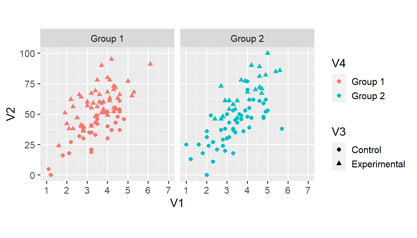
The facet_grid() function creates a grid of plots defined by a formula. In this case, the formula . ~ V4 states that we want distinct columns for each value of V4 (V4 on the right-hand side of ~) but don’t want distinct rows (. on the left-hand side of ~).
We can use the same function to also create distinct rows for each value of V3.
ggplot(d1, aes(x = V1, y = V2)) +
  geom_point(aes(shape = V3, colour = V4), size = 2) +
  scale_x_continuous(limits = c(1, 7), breaks = 1:7) +
  scale_y_continuous(limits = c(0, 100)) +
  coord_fixed(ratio = 6/100) +
  facet_grid(V3 ~ V4)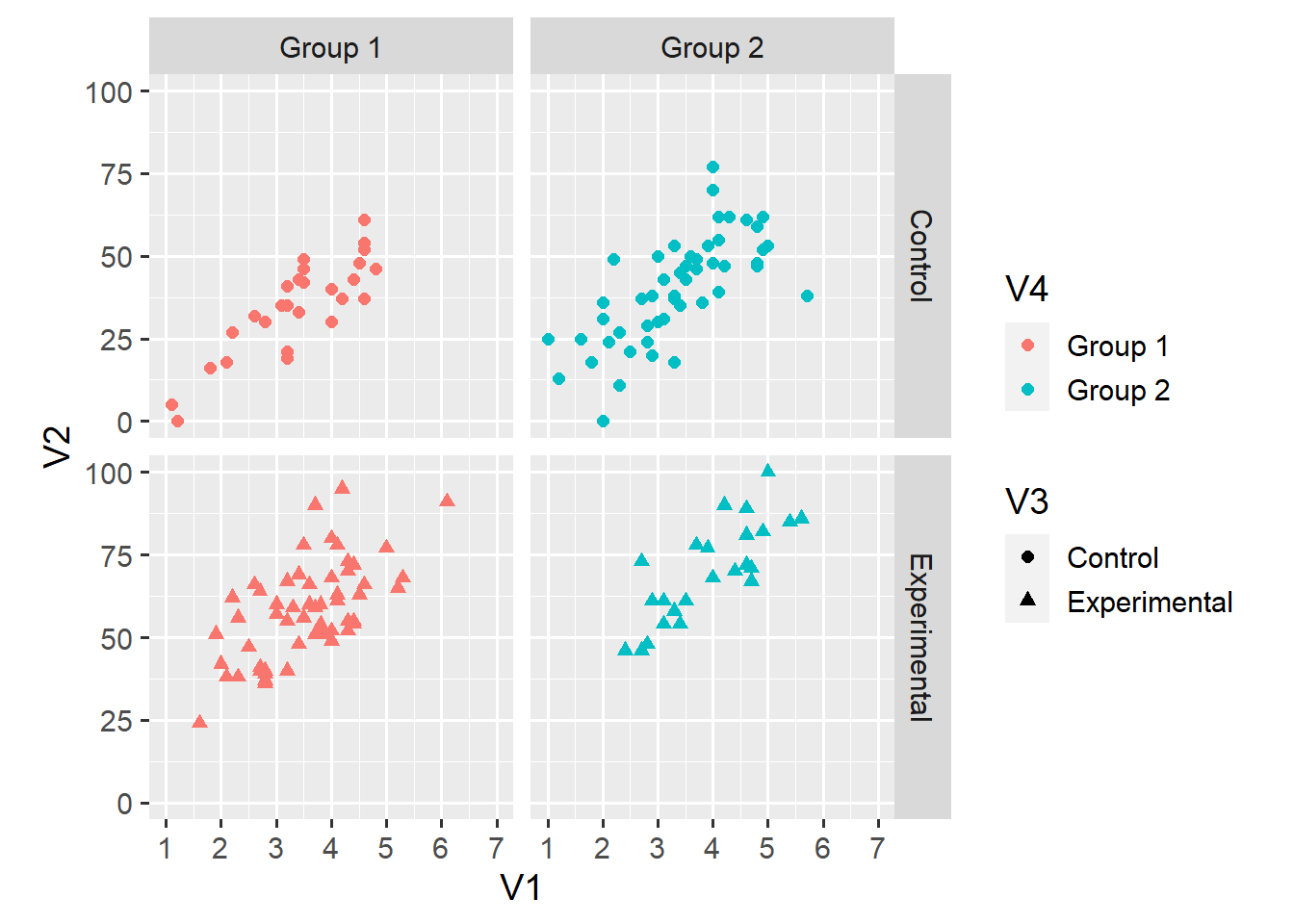
This plot shouldn’t need much explanation. The upper-left facet, for example, shows only observations for which V3 == "Control" and V4 == "Group 1. This display makes it somewhat easier to compare the relationship across the 2 x 2 groupings.
Still, our task might be easier if the plots were presented side by side. We can use the + operator to arrange all combinations of two (or more) variables along the same dimension (in this case, columns).1
ggplot(d1, aes(x = V1, y = V2)) +
  geom_point(aes(shape = V3, colour = V4), size = 2) +
  scale_x_continuous(limits = c(1, 7), breaks = 1:7) +
  scale_y_continuous(limits = c(0, 100)) +
  coord_fixed(ratio = 6/100) +
  facet_grid(. ~ V3 + V4) +
  theme(legend.position = "top")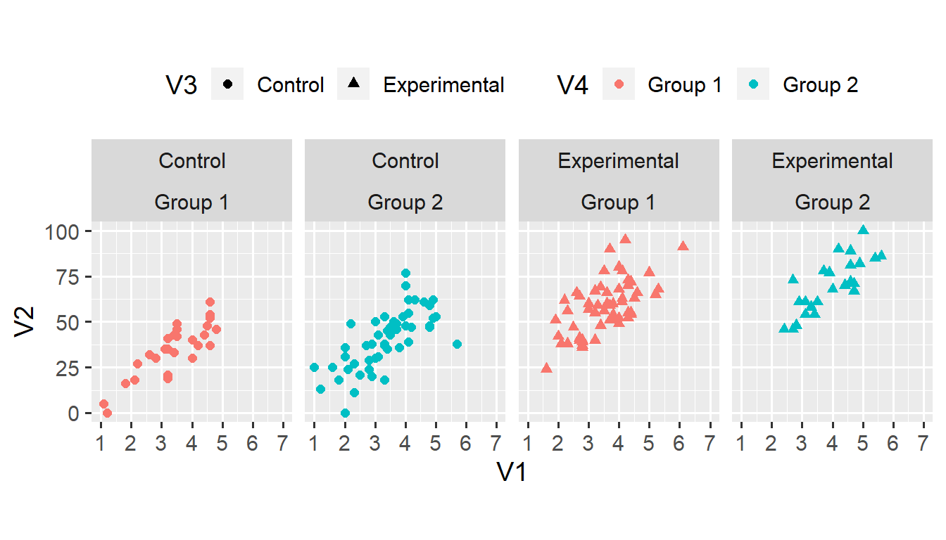
We can make the same plot by using facet_wrap(vars(V3, V4), nrow = 1) instead of facet_grid(. ~ V3 + V4). The facet_wrap() function takes only one dimension as input, and forces all categories (or combinations of categories) into a grid with the specified number of rows (nrow) or columns (ncol). This function is useful when faceting according to one variable with many categories (that wouldn’t fit into one row).
Facets make it easier to compare the relationship between V1 and V2 across combinations of V3 and V4. Still, we might improve this plot by fitting lines to each subset of the data. We do this by using the geom_smooth() function.
ggplot(d1, aes(x = V1, y = V2)) +
  geom_point(aes(shape = V3, colour = V4), size = 2) +
  geom_smooth(method = "lm") +
  scale_x_continuous(limits = c(1, 7), breaks = 1:7) +
  scale_y_continuous(limits = c(0, 100)) +
  coord_fixed(ratio = 6/100) +
  facet_wrap(vars(V3, V4), nrow = 1) +
  theme(legend.position = "top")
## `geom_smooth()` using formula 'y ~ x'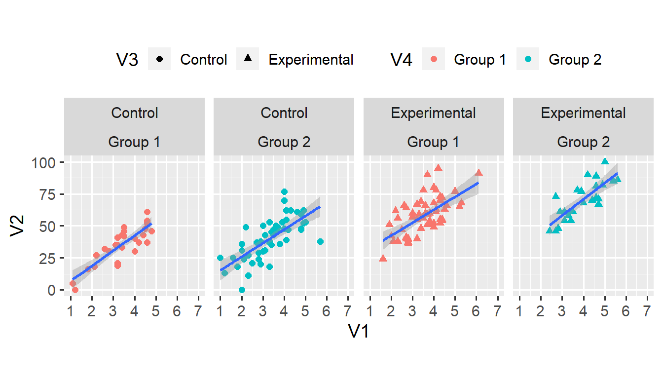
geom_smooth(method = "lm") does three things. First, it fits a linear model to the relationship between V1 and V2 in each subset of the data. Second, it adds a blue line that corresponds to the intercept and slope from the linear model. Third, it also adds a shaded ribbon that corresponds to the 95% confidence interval from the linear model.
We can recreate the parameter estimates from the linear model.
lm(V2 ~ V1, data = d1, subset = (V3 == "Control" & V4 == "Group 1"))##
## Call:
## lm(formula = V2 ~ V1, data = d1, subset = (V3 == "Control" &
## V4 == "Group 1"))
##
## Coefficients:
## (Intercept) V1
## -4.948 11.862The geom_smooth() function is a lot more powerful than this simple example lets on. Using the method and formula arguments allows fitting more complex, non-linear curves. I leave such advanced uses for a future post. For now, note that, as any geom, the function is applied to each facet of the plot.
With the lines in place, we might be able to go back to just two facets.
ggplot(d1, aes(x = V1, y = V2)) +
  geom_point(aes(shape = V3, colour = V4), size = 2) +
  geom_smooth(method = "lm") +
  scale_x_continuous(limits = c(1, 7), breaks = 1:7) +
  scale_y_continuous(limits = c(0, 100)) +
  coord_fixed(ratio = 6/100) +
  facet_grid(. ~ V4)
## `geom_smooth()` using formula 'y ~ x'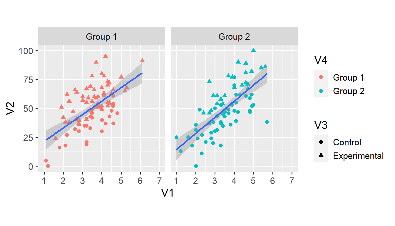
Alas, we are now left with only one line per facet. To create distinct lines for each condition, we use the group aesthetic that we haven’t yet encountered.
ggplot(d1, aes(x = V1, y = V2)) +
  geom_point(aes(shape = V3, colour = V4), size = 2) +
  geom_smooth(aes(group = V3), method = "lm") +
  scale_x_continuous(limits = c(1, 7), breaks = 1:7) +
  scale_y_continuous(limits = c(0, 100)) +
  coord_fixed(ratio = 6/100) +
  facet_grid(. ~ V4)
## `geom_smooth()` using formula 'y ~ x'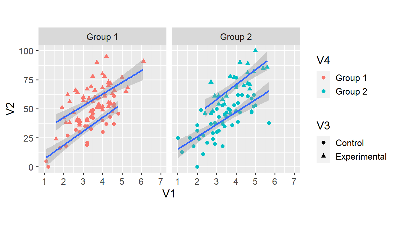
At this stage, we might as well map the colour of all points and lines onto each observation’s condition. We do this by specifying the colour argument within the ggplot() function. This means that all geoms that have a colour aesthetic inherit this aesthetic from the ggplot() function.2
ggplot(d1, aes(x = V1, y = V2, colour = V3)) +
  geom_point(aes(shape = V3), size = 2) +
  geom_smooth(aes(group = V3), method = "lm") +
  scale_x_continuous(limits = c(1, 7), breaks = 1:7) +
  scale_y_continuous(limits = c(0, 100)) +
  coord_fixed(ratio = 6/100) +
  facet_grid(. ~ V4)
## `geom_smooth()` using formula 'y ~ x'
Assigning a distinct colour to all values of V3 takes care of the grouping, which means that we don’t need the group = V3 argument anymore. We can add two more aesthetic arguments to the geom_smooth() function.
ggplot(d1, aes(x = V1, y = V2, colour = V3)) +
  geom_point(aes(shape = V3), size = 2) +
  geom_smooth(aes(fill = V3, linetype = V3), method = "lm") +
  scale_x_continuous(limits = c(1, 7), breaks = 1:7) +
  scale_y_continuous(limits = c(0, 100)) +
  coord_fixed(ratio = 6/100) +
  facet_grid(. ~ V4)
## `geom_smooth()` using formula 'y ~ x'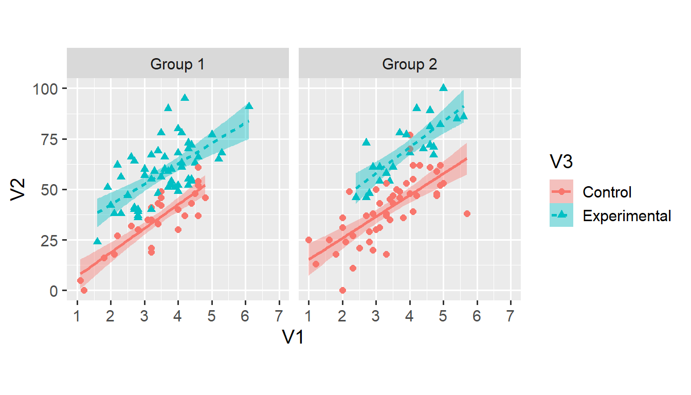
Both fill = V3 and linetype = V3 shouldn’t need much explanation. Again, note that the legend has changed to reflect the newly added aesthetics. As discussed, using both colour and linetype makes the plot more accessible for people with colour vision deficiencies.
In this case, I prefer the simpler plot with grey ribbons—but that’s just a matter of taste. Both plots seem equally clear and accessible to me.
And that’s it for this post. You now understand how to explore datasets using facets and curves. If you have a question or found a mistake, please comment on Twitter or send me an email. Anyway, let me know what you think!
Next week, we’ll move on to a new dataset. I’ll write about how (not to) use bar charts to visualise within-subjects data—and what to use instead.